Typographic study
Wolfgang Weingart
An editorial and typographic study informed by Wolfgang Weingart’s experimental approach.
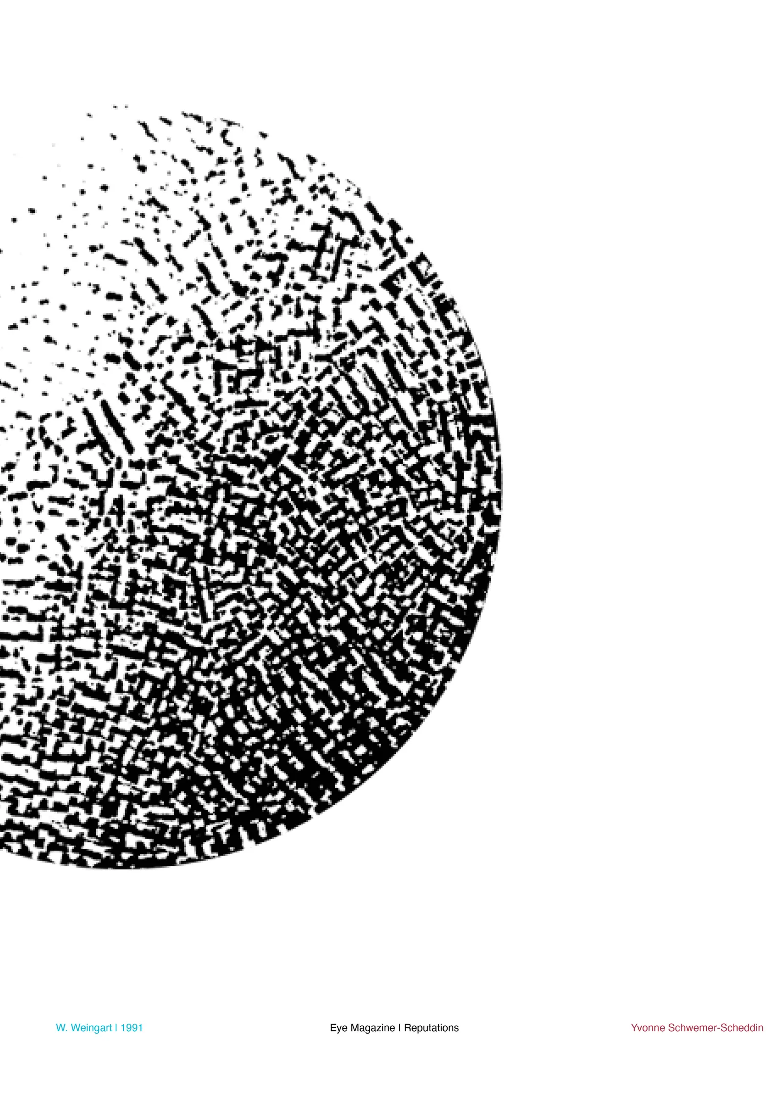
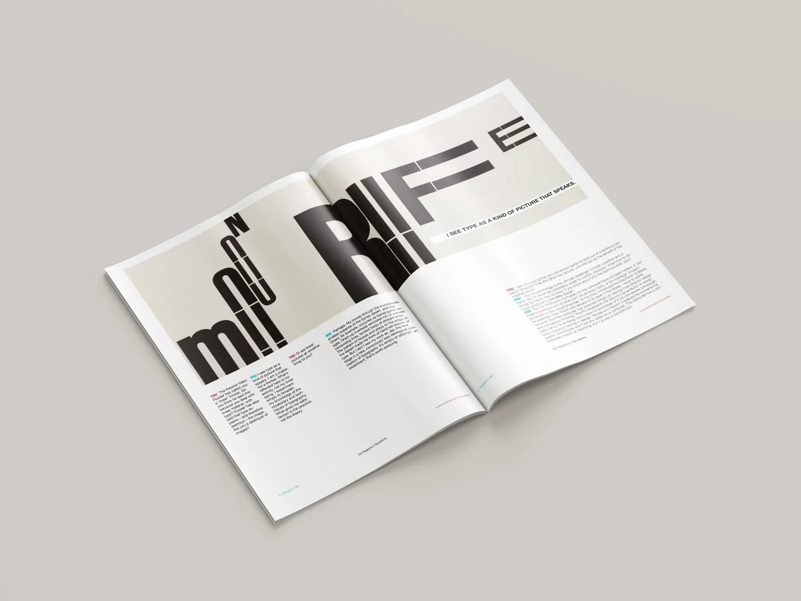
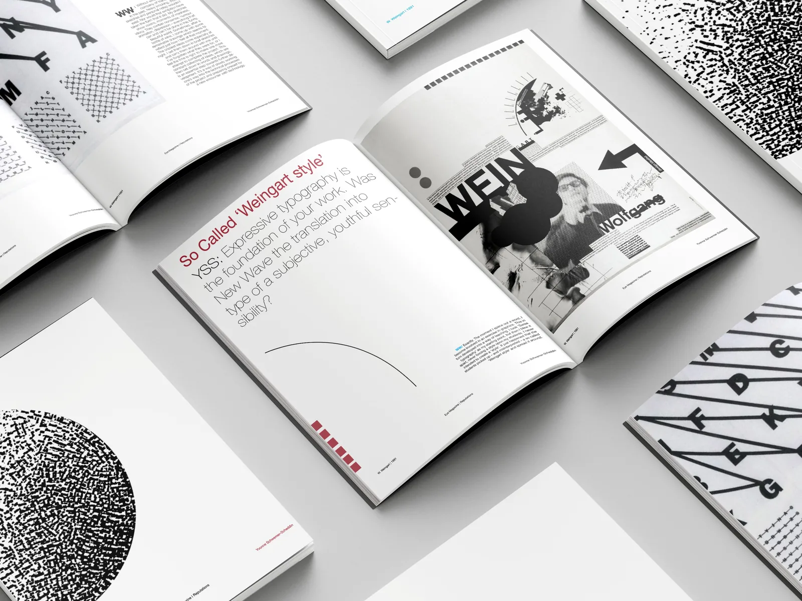
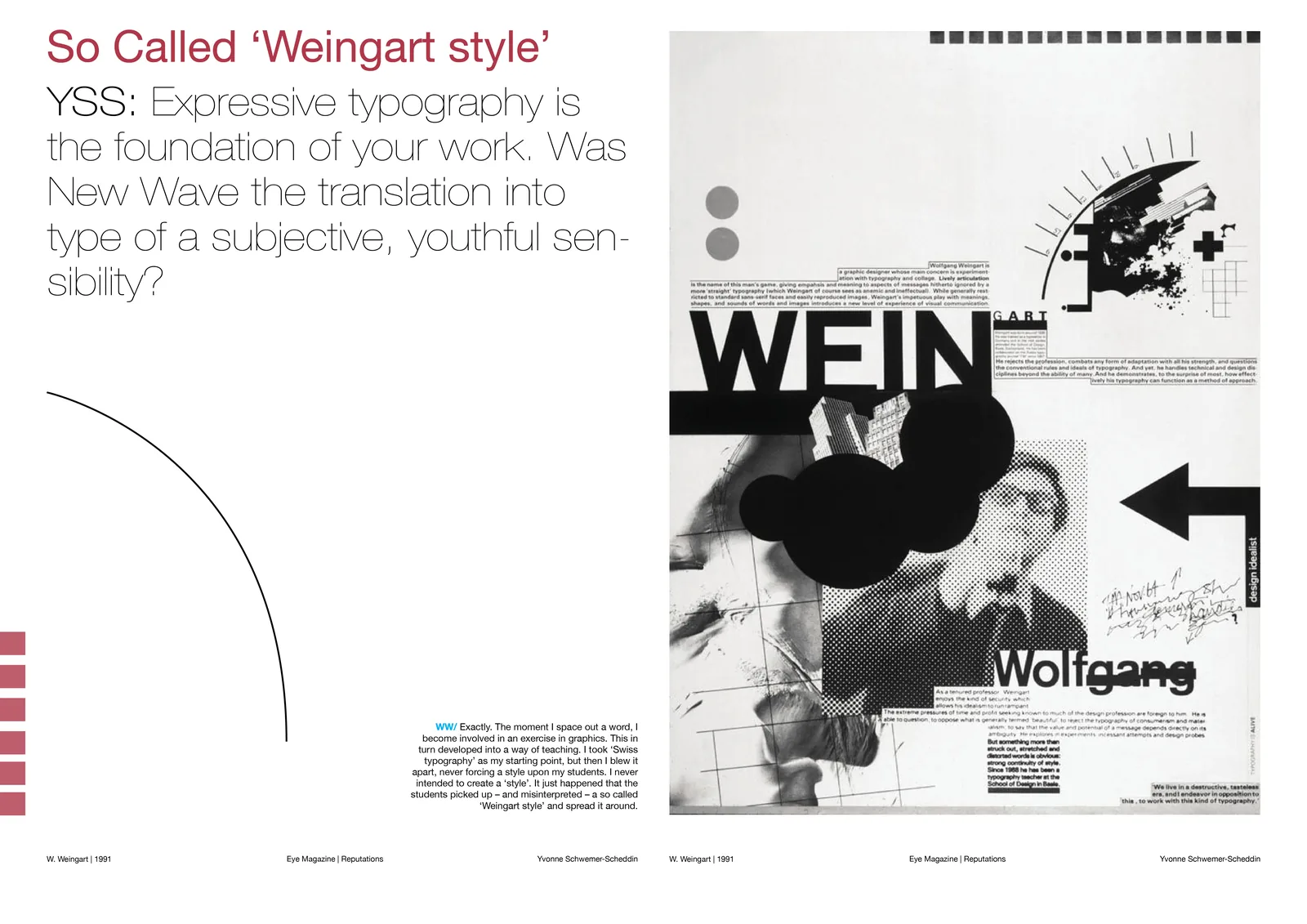
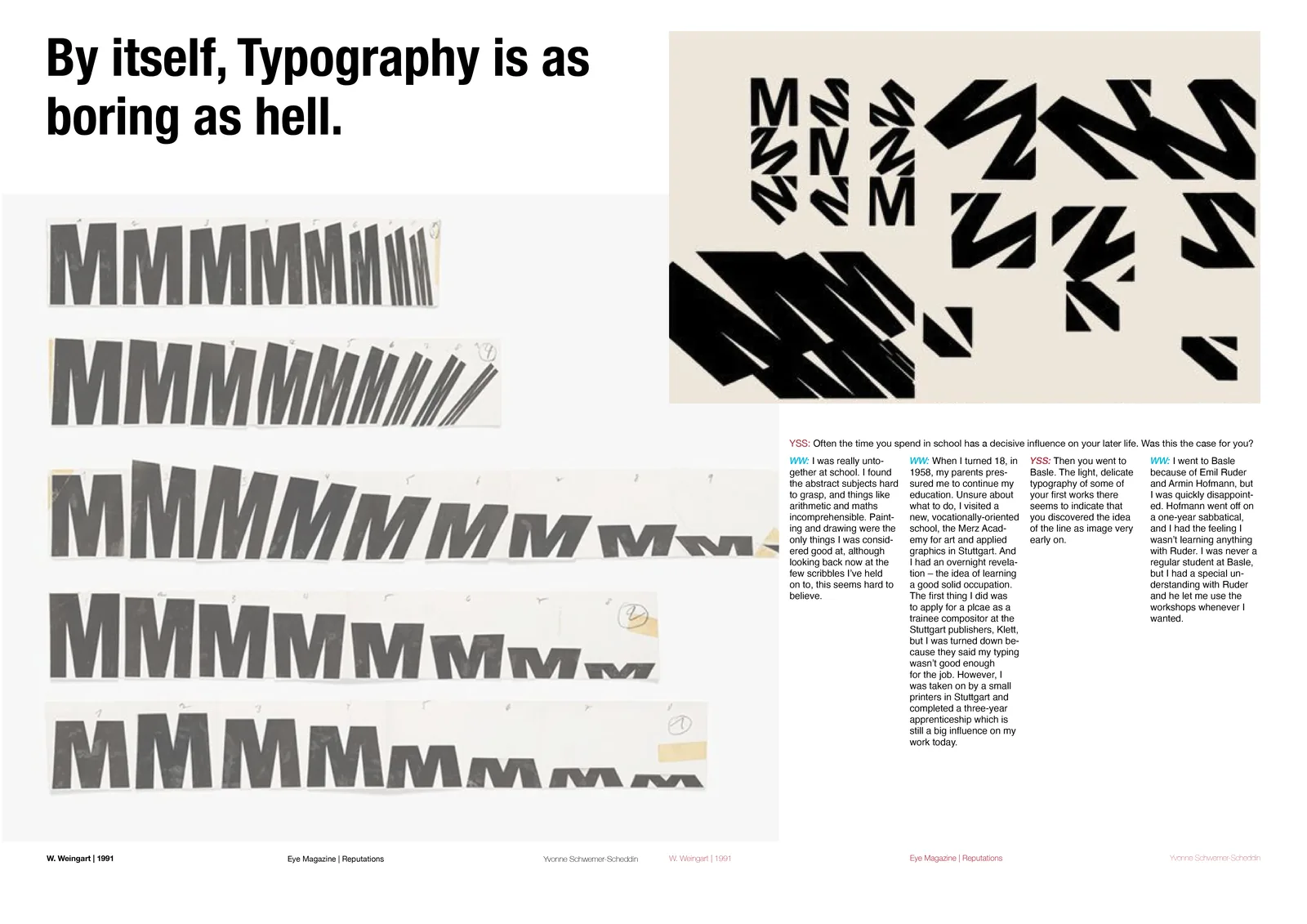
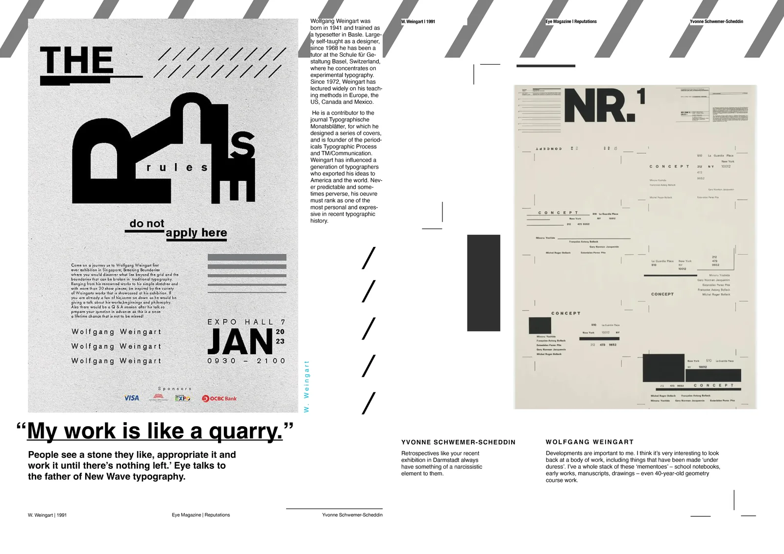
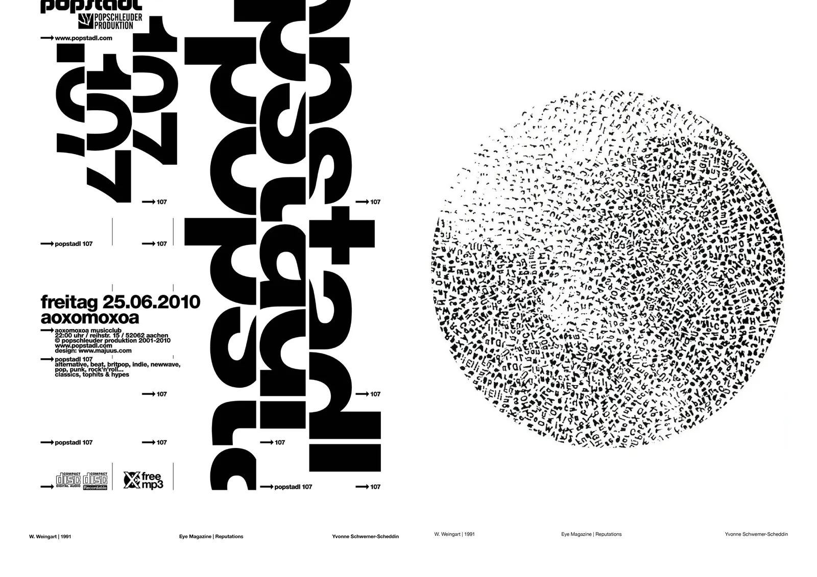
A magazine feature, poster and type motion piece exploring Weingart’s experimental typography. The feature sets Yvonne Schwemer-Scheddin’s “Reputations: Wolfgang Weingart” (Eye, 1991) on a 5 × 7 grid, then breaks it with layered letterforms, shifting scale and dense texture.
Grid and structure
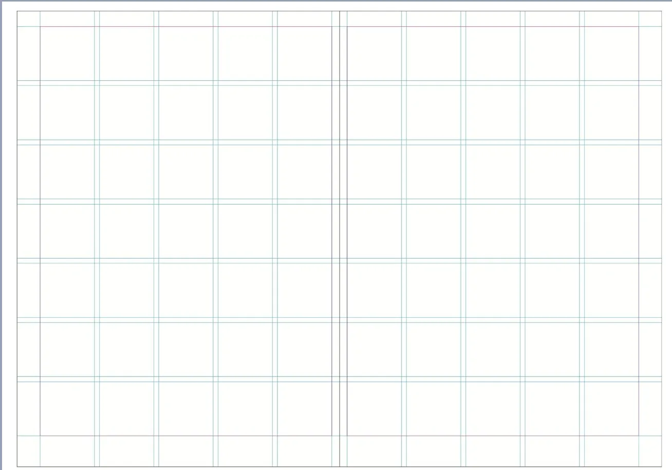
A 5 × 7 grid and a page map plan the sequence before the type is broken.
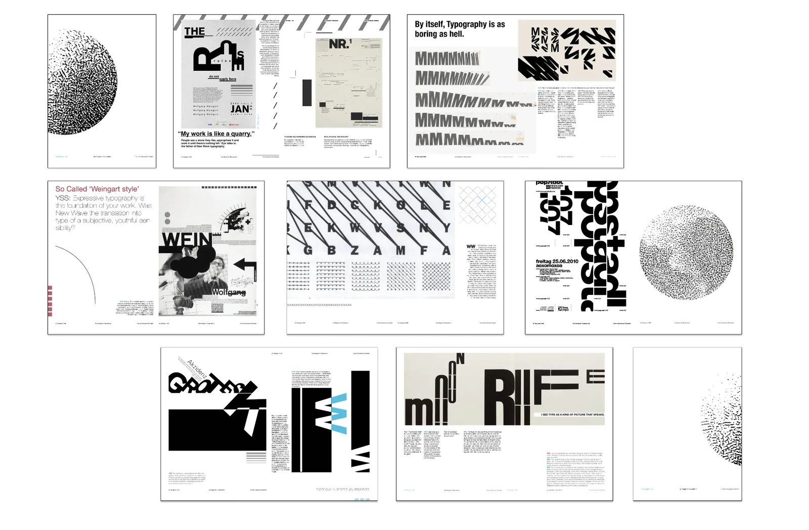
Every page
The full magazine, page by page.
Selected spreads
Cover